


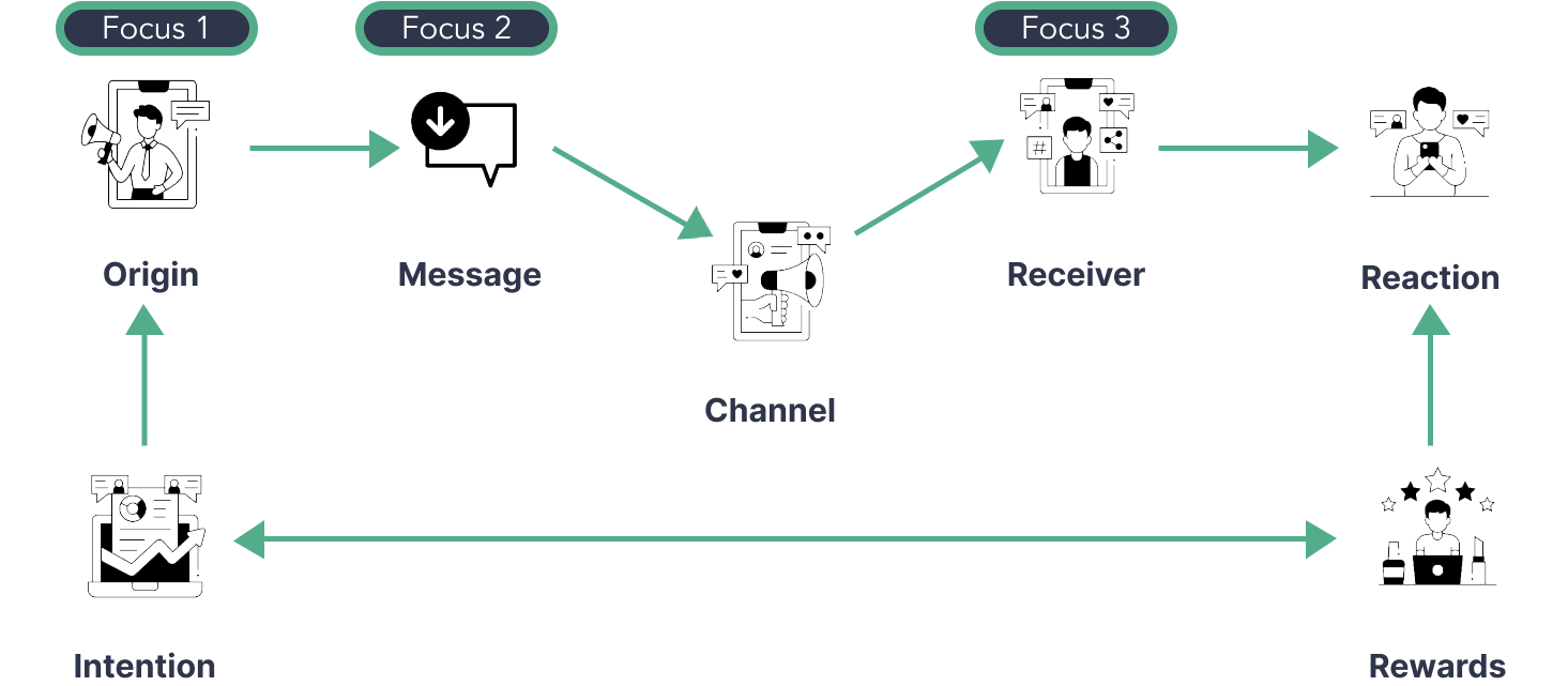
Misinformation spreads 6 (six) times faster than accurate information among the same audience through social media platforms as the primary distribution channels. These channels have features that allow targeting specific groups and evoking emotional reactions, leading to higher engagement and a resulting spread in false information. There are a total of 7 (seven) touchpoints in the spread of misinformation of which I identified three key factors with the highest impact: the origin, the message, and the receiver.
A platform that enhances the message's quality, promotes engagement with trustworthy sources of information for the creator, and offers credibility evaluation for the receiver.
To effectively combat misinformation, this solution would utilize natural language processing and access to verified sources to improve the quality of information. By labeling and fact-checking content, credibility assessment can be achieved. The goals of this solution focus on the original content creator, the information verifier, and the audience.
Goal#1 Facilitate the sourcing of verified information.
Goal#2 Enhance the quality of published content.
Goal#3 Encourage positive engagement habits among the audience.
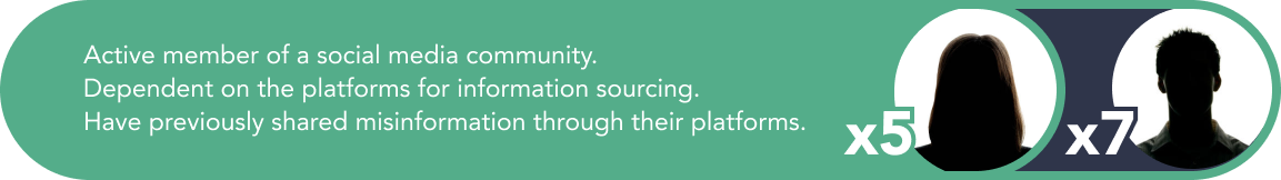
In order to better understand my users, I conducted interviews with content creators who use social media platforms to gather information, are active participants of online communities and have also shared false information within their networks in the past. During the interviews, I aimed to explore the information-seeking and sharing patterns, motivations, pain points and perceptions of the effects of false information with each respondent.
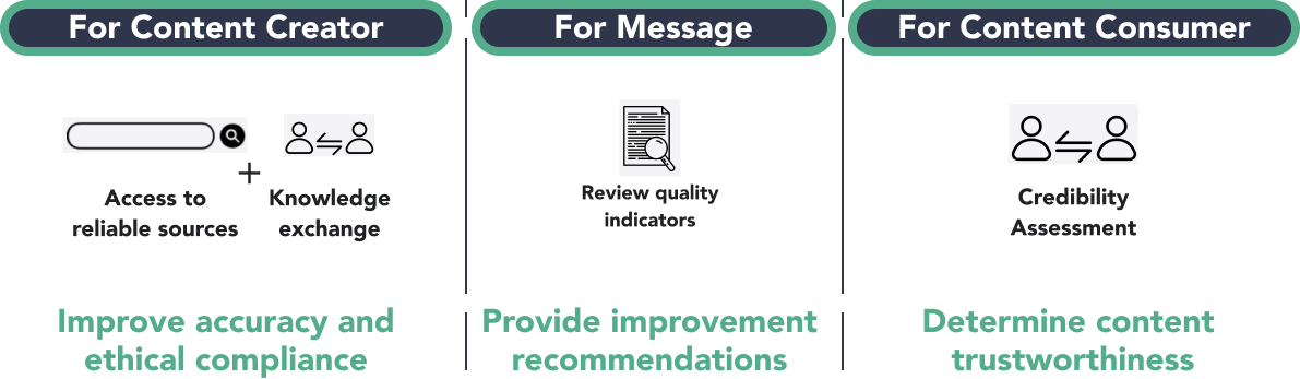
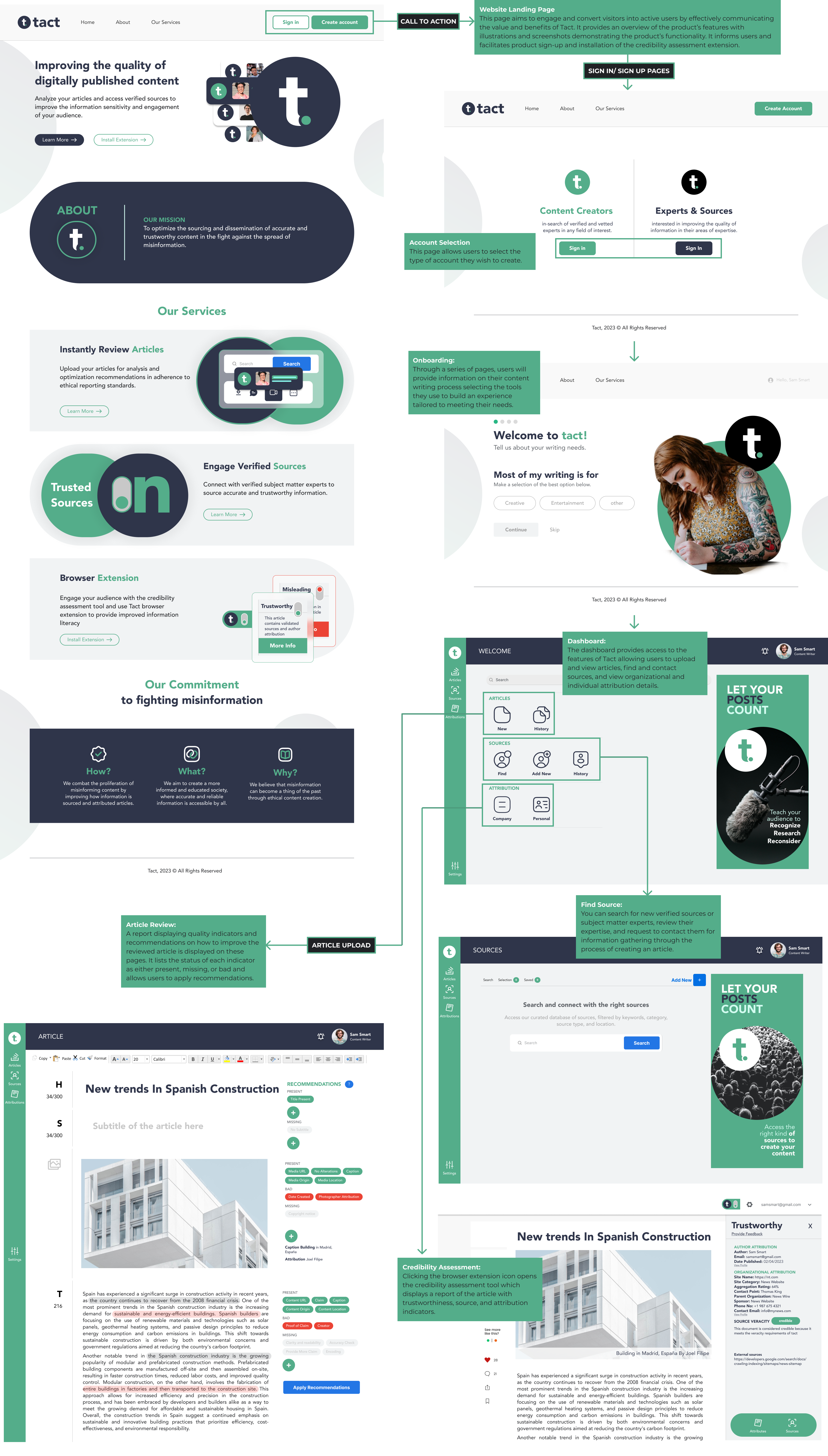
When assessing articles, sources, and attributions, we use quality indicators to determine their reliability. These indicators are grouped under the recommendation section of the article review tab, with each indicator being color-coded in green, red, or gray depending on its status.
The content quality indicators are designed to help content creators improve the accuracy and verifiability of their articles. These indicators include verification of information, self-obtained photographs,references to primary sources, sufficient documentation, identification of corporate sources, and investigative journalism present.
Meanwhile, the source and attribution indicators are assessed to determine their quality and reliability. These include author expertise and credentials, publication/website reputation, bias and objectivity, accuracy and reliability, currency and timeliness, writing style and readability, source reliability, timeliness, accuracy, objectivity,clarity, and completeness. Our assessment tool presents these individual fields to end-users, making it easier for them to engage with the published article.
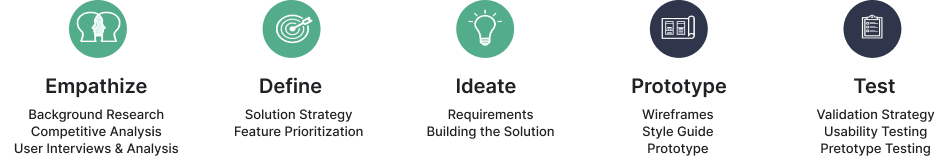
To build a minimum viable version of the solution, I identified basic, performance and delighter features necessary for its functionality. I then prioritized these requirements using MoSCoW methods to actually stat to build out a product.
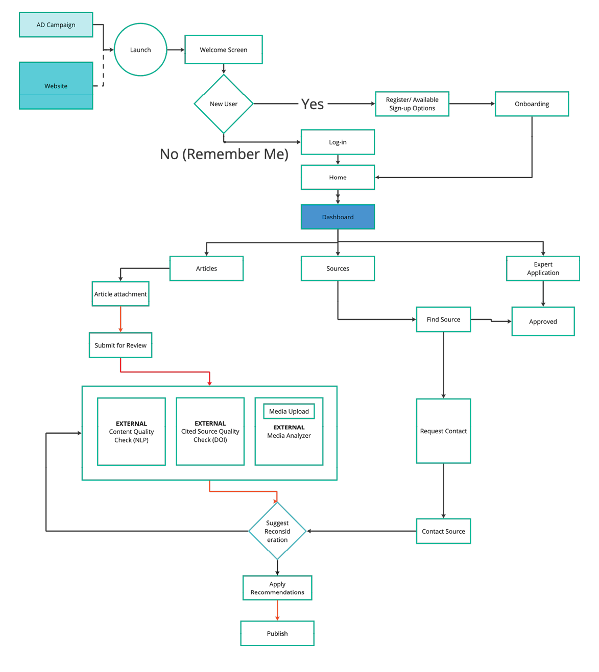
Starting with the log-in/sign-up process, the diagram maps out the interactions and decision points of the user. Once the onboarding and profile creation process is complete, a user who is a content creator will have access to the dashboard to perform an article review or a search for sources while a subject matter expert can submit his profile for verification and approval.
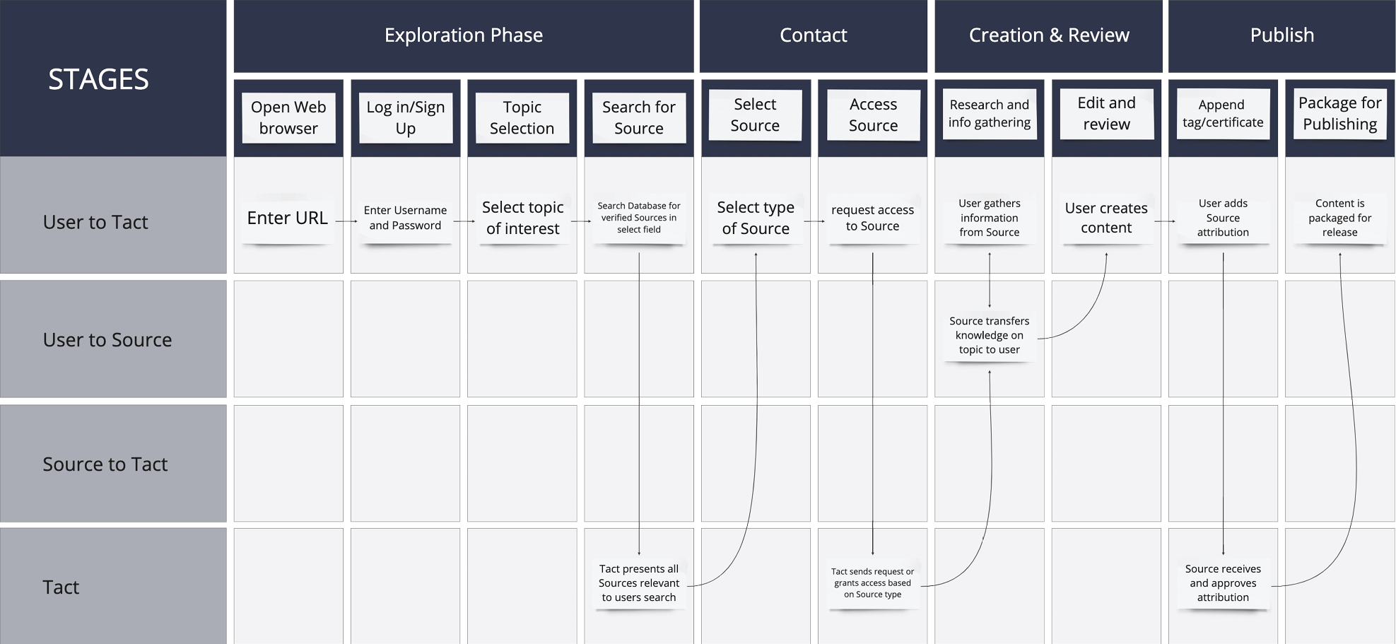
The service blueprint diagram provides a comprehensive overview of the service delivery process, detailing all the touchpoints, processes, and actors involved in delivering services.Additionally, the diagram maps out the user and source journey, which helps to identify critical areas in the delivery process.
For users, there are four main phases. The first phase involves exploring verified sources and consulting subject matter experts. Once signed up, users can search using keywords or topics to find relevant sources. They can then assess each source's attribution and qualifying metrics before contacting the source or accessing the source material to gather knowledge. The insights gathered are then used to create an article, which undergoes review and optimization recommendations before being packaged and attached for publishing.
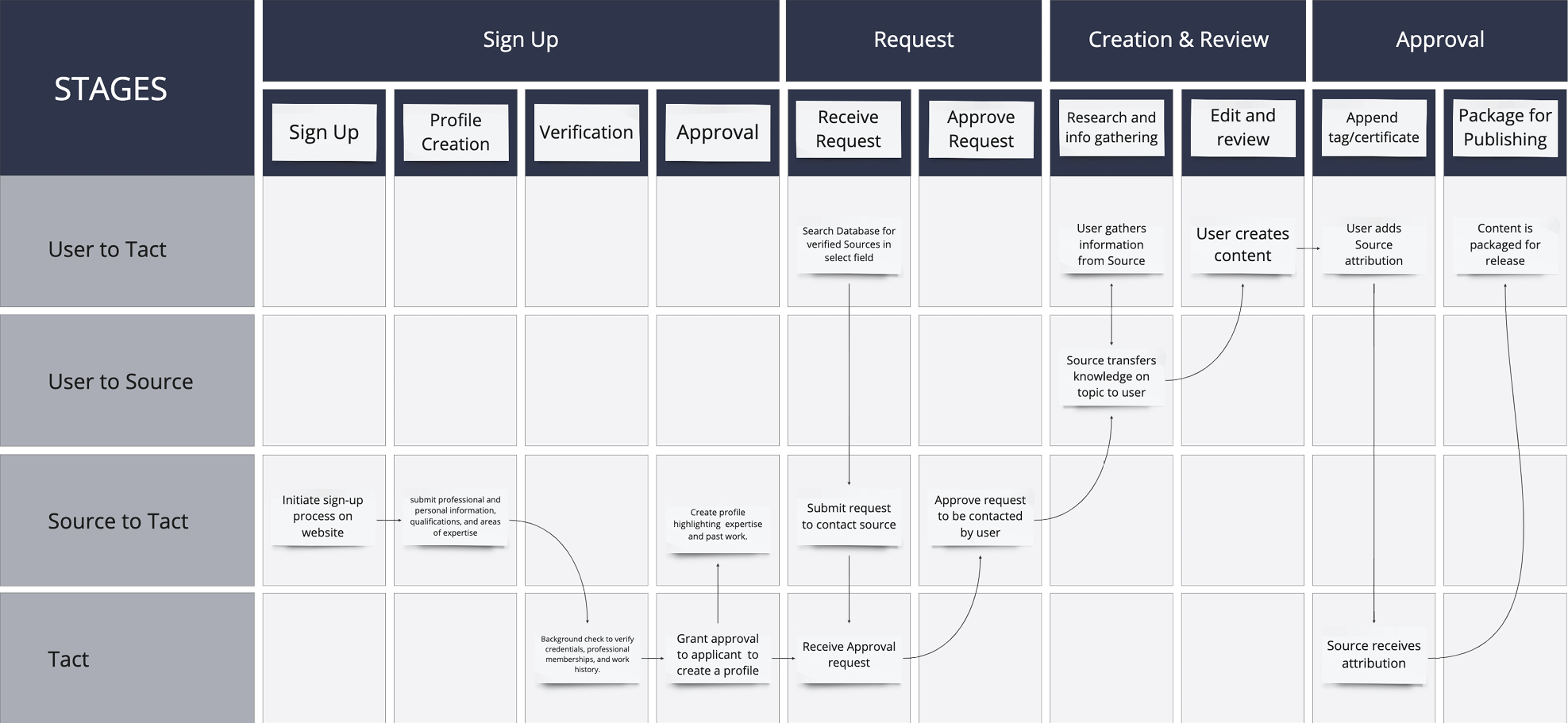
Subject matter experts are required to submit their professional and personal information, qualifications,and areas of expertise during their application process. Tact then conducts a background check to verify the submitted credentials, professional memberships,and work history. Once verified, the applicant is approved to create a profile that highlights their expertise and past work.This profile is visible to content writers who use the app's search bar. Tactrecommends experts to the content writer who can express interest through an inbuilt messaging feature to discuss project details.
The expert has the freedom to accept or reject requests sent by content writers through the app's messaging feature. As a result, you have complete control over which projects you acceptand can select those that best suit your skills and interests. Experts can join the expert community for free or be members of existing professional bodies. When a content writer requests information from a verified expert, the expert is notified and can choose to accept or reject the request. With Tact, content writers can confidently rely on our expert network for reliable and valuable information.
The site map provides an overview of the main sections, sub-sections, and pages, enabling users to easily find and access the different product features. Users are able to search and apply filters to articles and sources to aid their selection process.
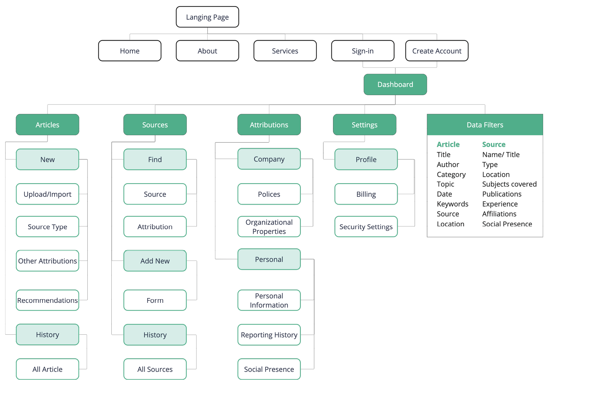
The information architecture creates a clear navigation system, categorizing content effectively, and improving functionality to make it easy to find and access articles, sources, and other relevant information.
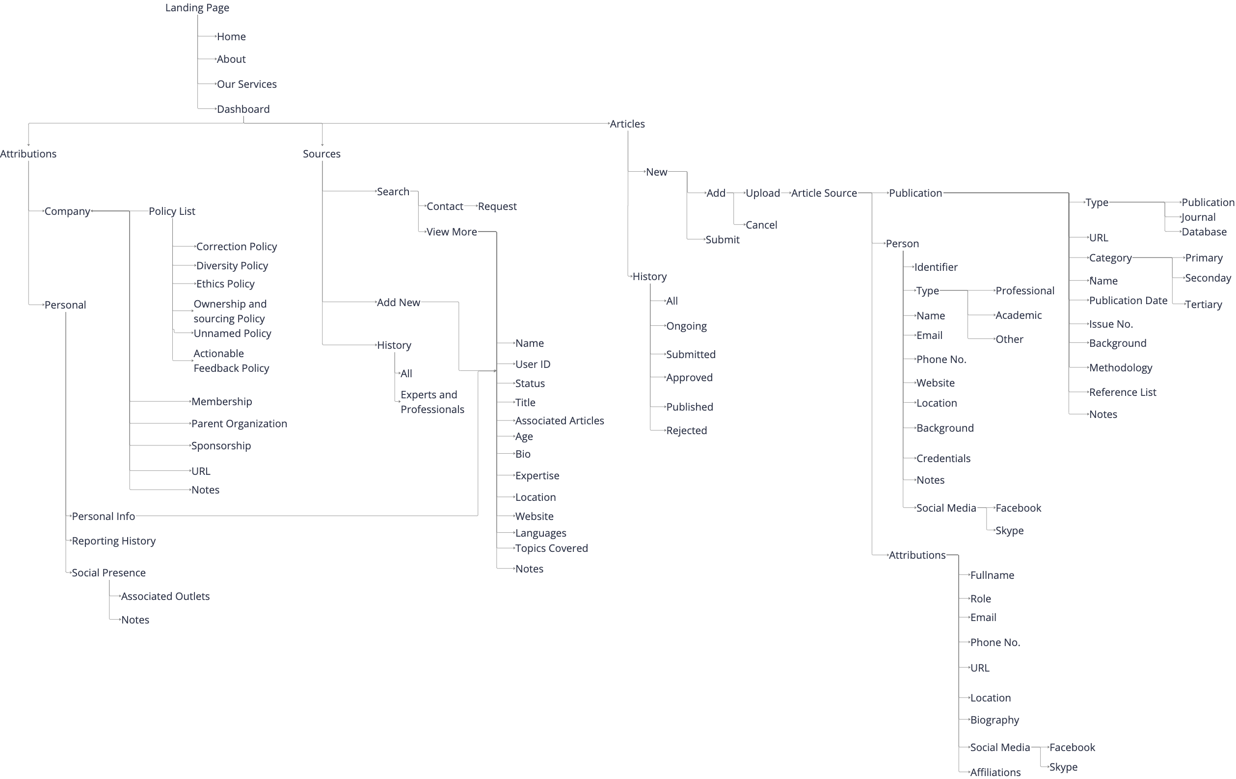
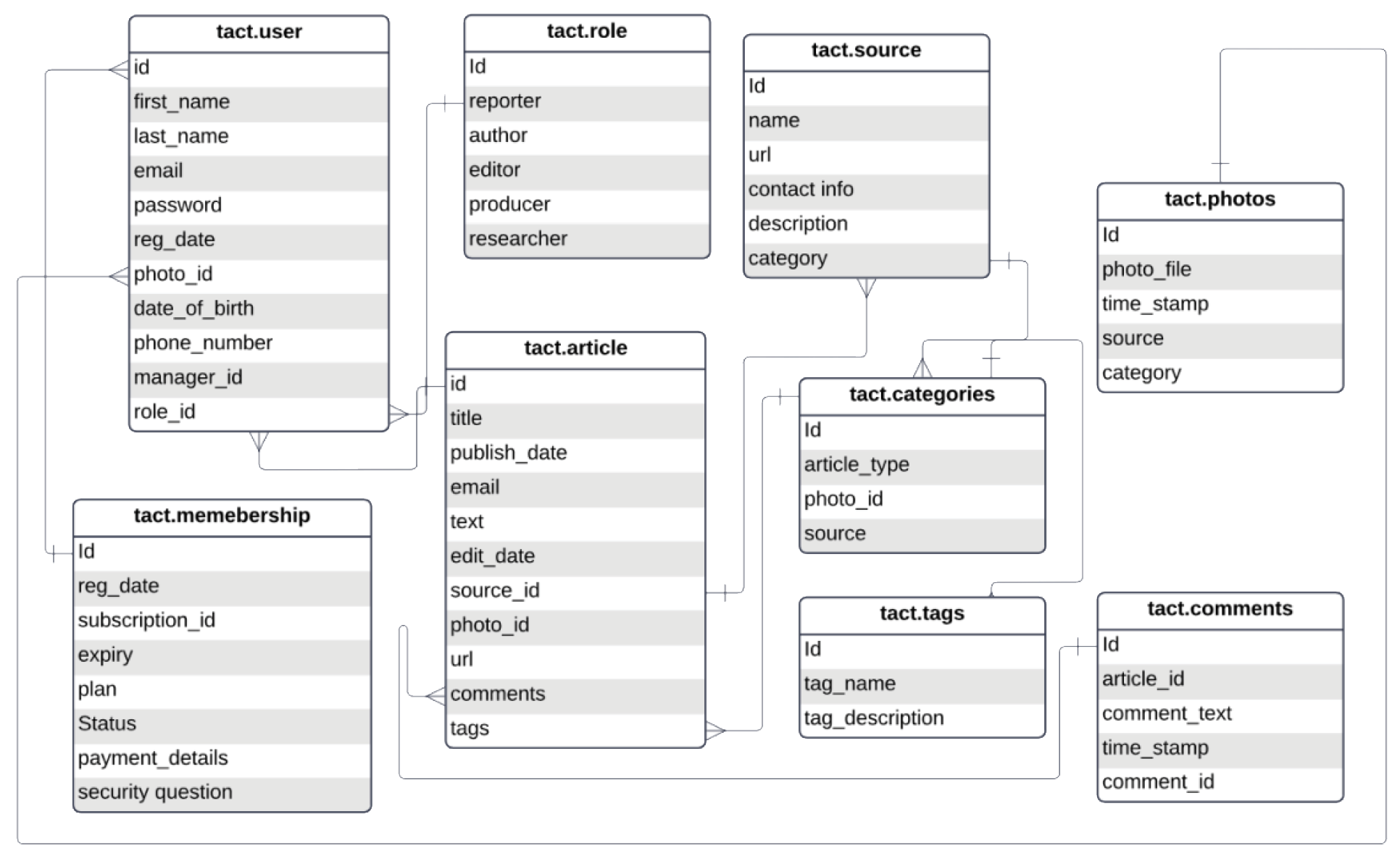
The database provides the necessary analysis and filtering of information related to articles and sources allowing users to efficiently retrieve and manage data. With the tables storing attributes and metadata like title, author, publication date, content, and source name, the database enables fast and reliable search and retrieval to enhance Tact’s functionality.
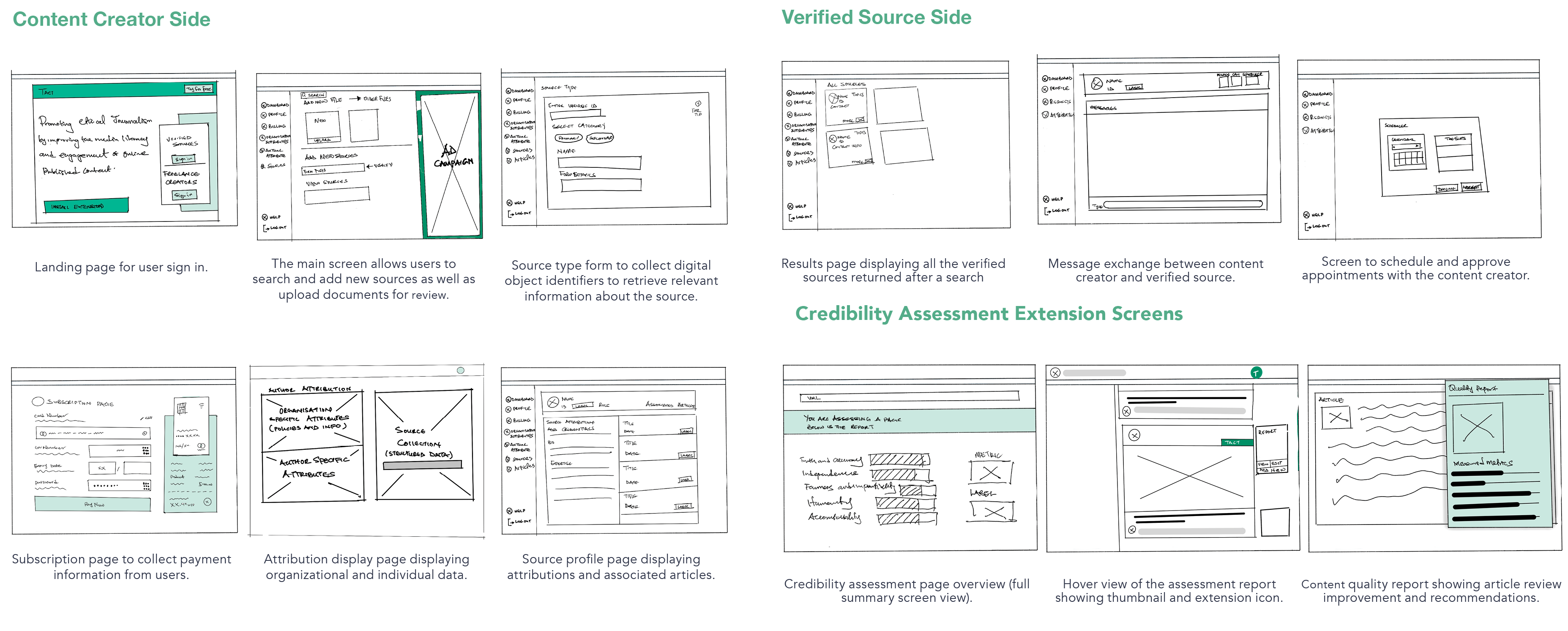
The hand-drawn wireframes I developed allowed me to quickly explore different design ideas and concepts to create a rough representation of the product’s interface and allowed me to refine the layout efficiently.
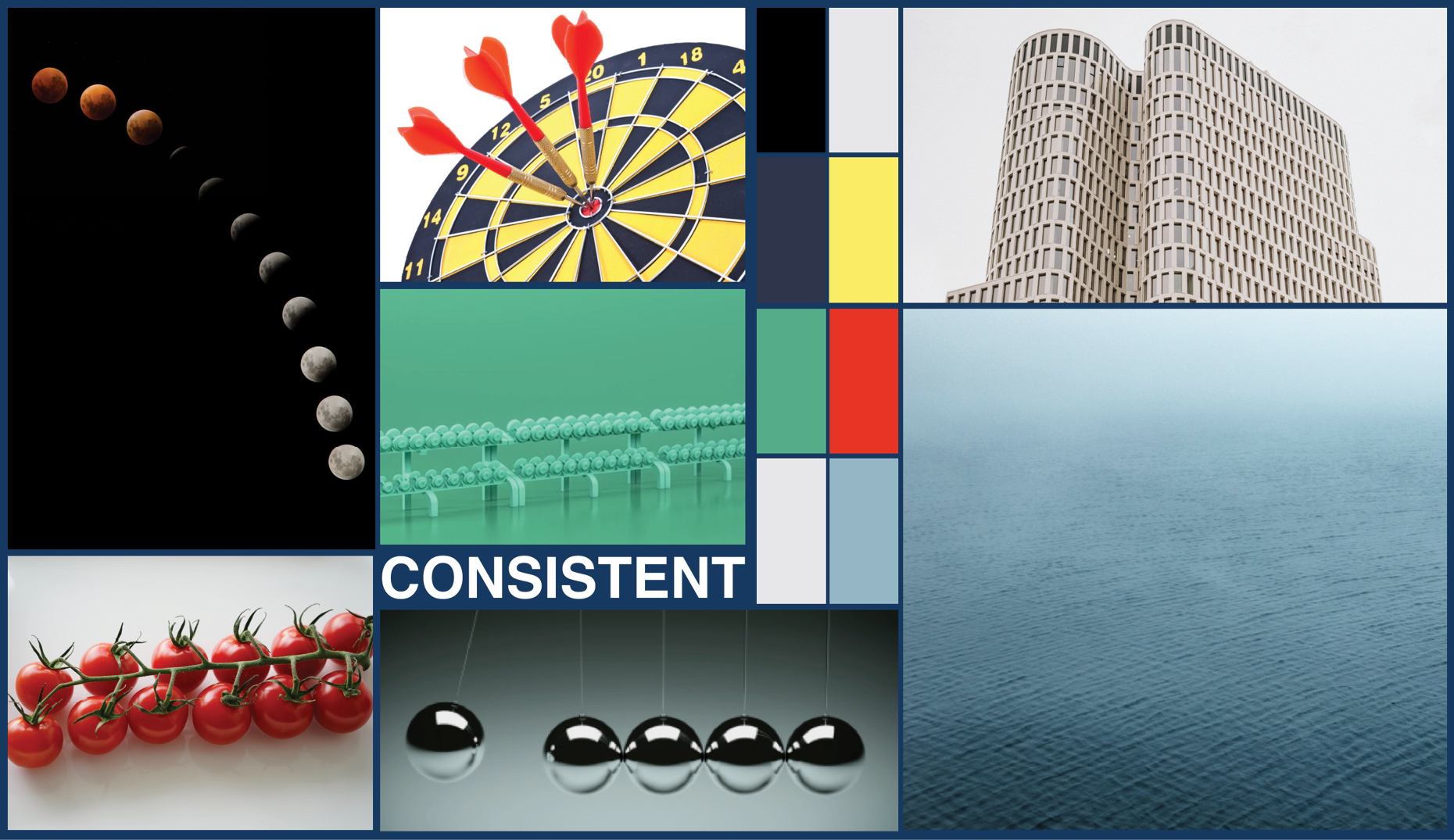
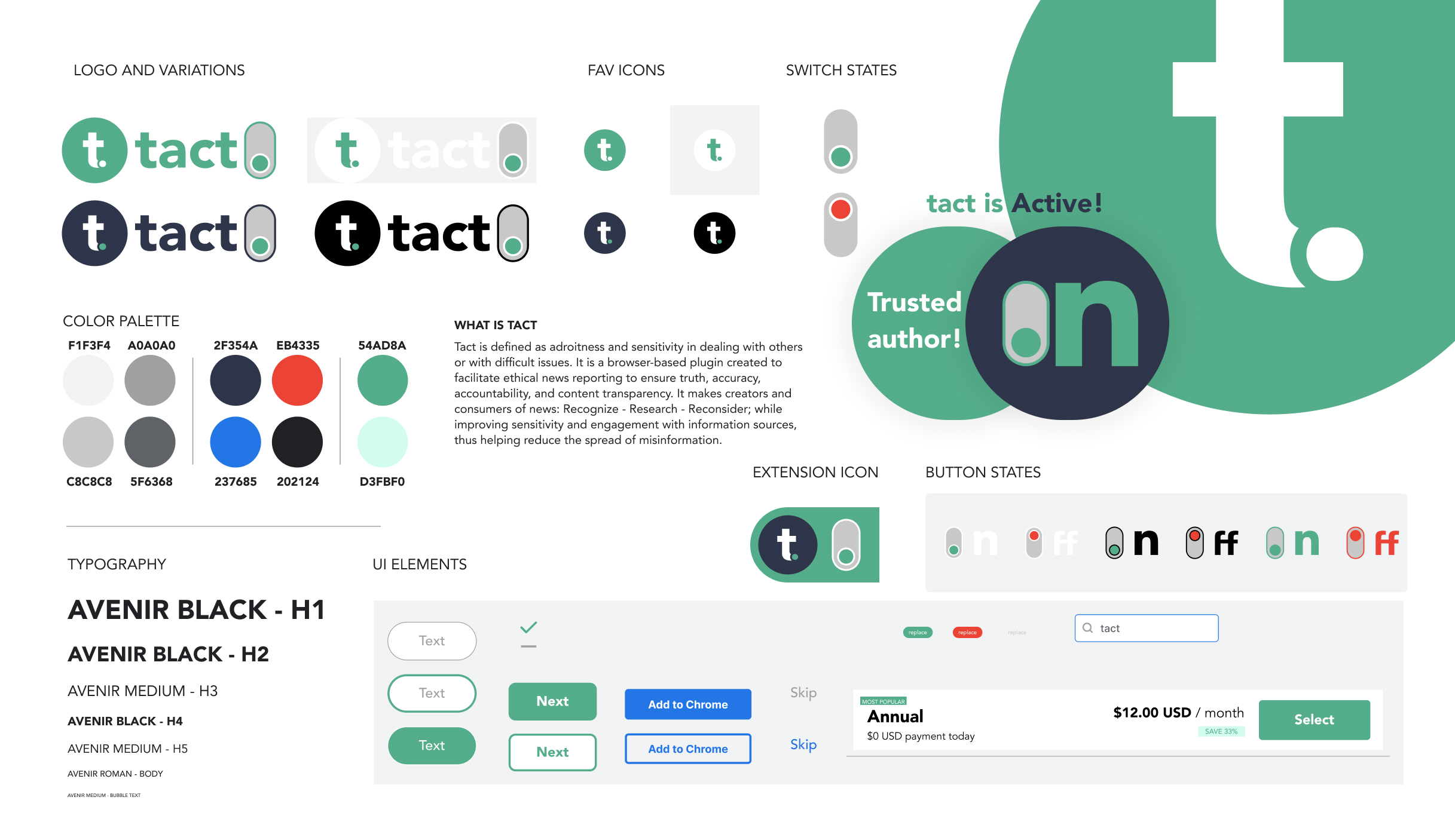
I created five mood boards with different design directions for the product’s visual identity. The mood boards were called "consistent,""usable," "operational," "transparent," and"detailed." After careful consideration, I selected"consistent" as the primary focus because it aligns with the product's core values of truth, accuracy, and transparency. This design emphasizes visual harmony, uniformity, and cohesiveness. My vision for the product was to showcase a consistent use of typography, color, and layout. This reflects the brand's commitment to reliability and professionalism and creates a visually pleasing user interface that communicates transparency and trustworthiness.
The style guide of the brand emphasizes consistency, which is based on its core values of truth, accuracy, and transparency. I used letters from each core value to create the name of the brand “TACT” (T – Truth, AC –accuracy, and T – transparency) visually representing these values through the product name, logo, color palette, and typography. I used a color scheme that consists of shades of blue and green, symbolizing trust, reliability, growth, balance, and positivity. The addition of complementary neutral tones and red create a professional and polished look, evoking a sense of reliability, professionalism, and caution.The font Avenir was chosen for its modern and legible appearance, which reflects the product's commitment to accuracy.
The brand logo incorporates an icon, wordmark, and switch,which can be used individually or in combination. The switch design draws inspiration from on/off switches and traffic lights, with green representing engagement and red representing caution. The browser extension icon indicates the credibility status of an article, with an on-state indicating trustworthiness and off-statewarning users to exercise caution. The different buttons and icons used within the product's interface are designed to be user-friendly and accessible through the dashboard sidebar.
Following the developed style guide, I developed the first iteration of high-fidelity mockups and tested its usability. Below is a summarized view of the prototype.
Iterations and useability test results are being updated.
Akin Agboola © 2023